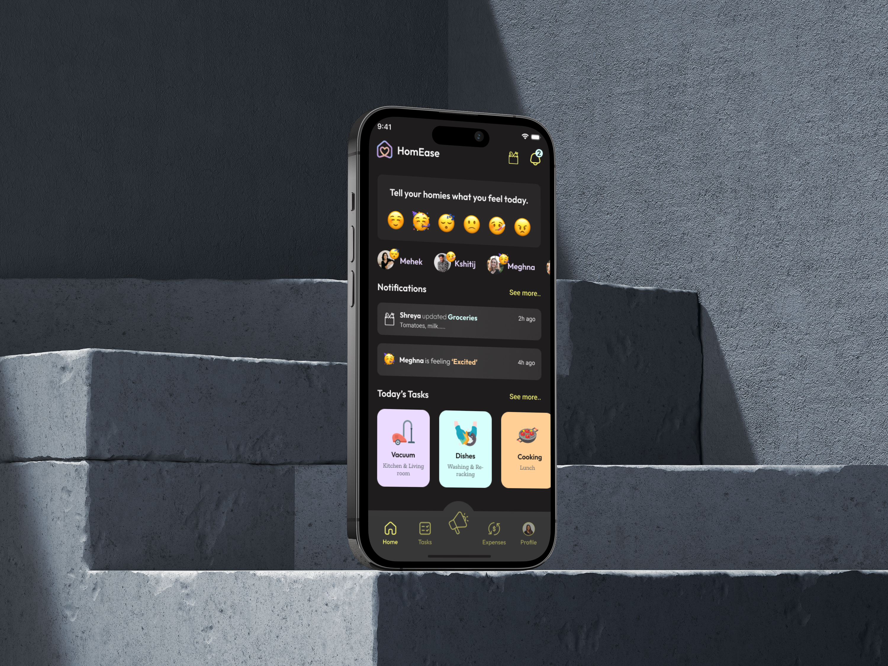
Streamlined healthcare insurance provider portal with 5 usability fixes, boosting task success by 40%.
Portal
Usability
- Role:
- Research, UI/UX Design, Interaction Design
- Team:
- 5 UI/UX designers
- Tools:
- Figma, FigJam
- Duration:
- 4 Months

Project Overview
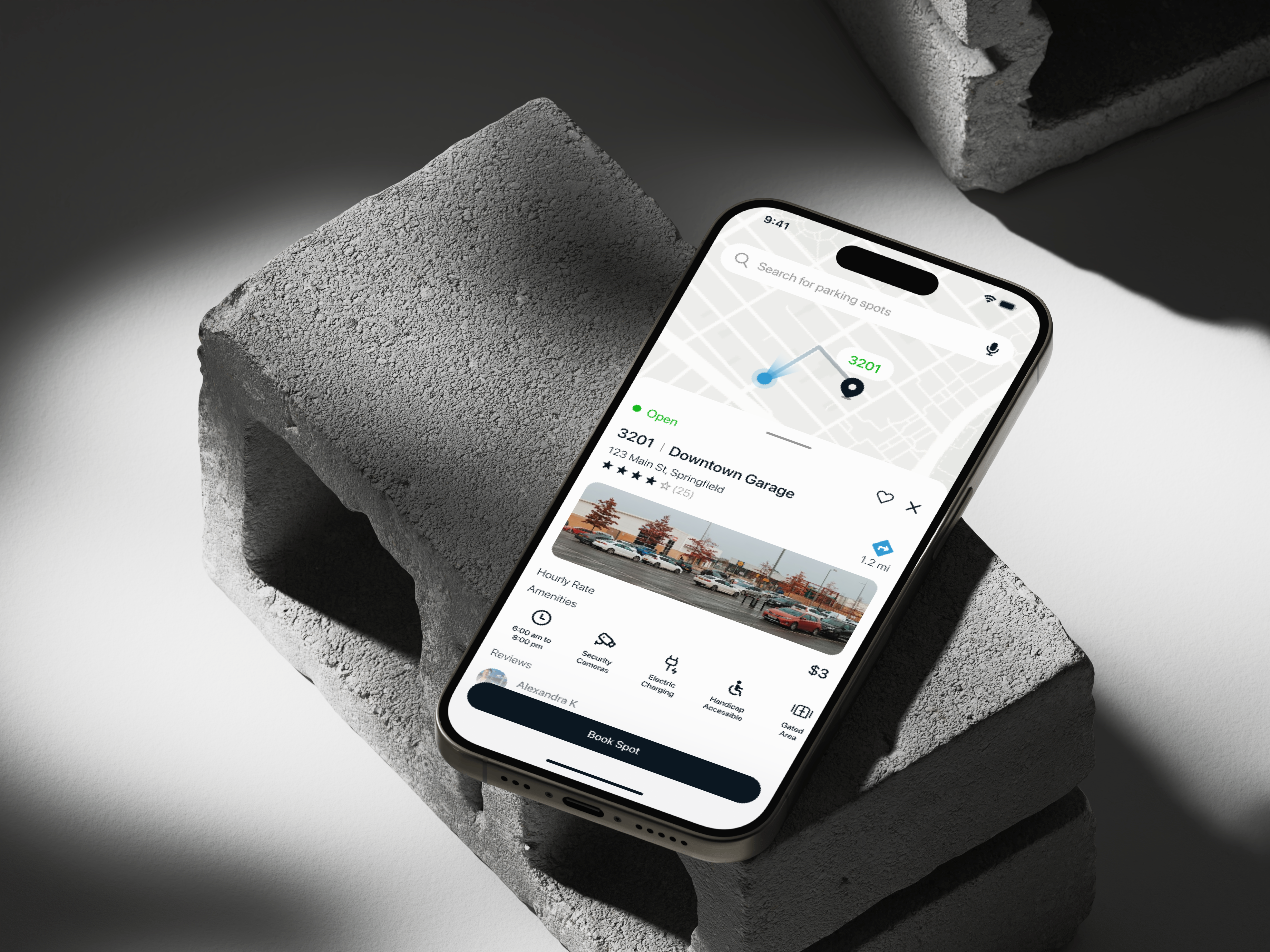
As part of a university–industry collaboration, our team worked with a leading U.S. healthcare provider to evaluate the usability of their member portal and mobile app. The focus was on the communication preference center, a feature that allows members to update contact information and manage how they receive important notifications.
Goal
To assess how easily members could update contact details and communication preferences, and identify improvements to boost success, efficiency, and trust.
Outcomes
- 40%
increase in task success rates by simplifying flows and adding confirmation feedback.
- 50%
reduction in task completion time, cutting average actions from 88s to 32s.
- 64%
decrease in user errors by clarifying terminology and fixing toggle behavior.
Research Methodology
We used a two-phase research approach, starting with a heuristic evaluation to identify potential usability issues, followed by usability testing with 14 participants to validate those findings through real user behaviors.
Heuristic evaluation
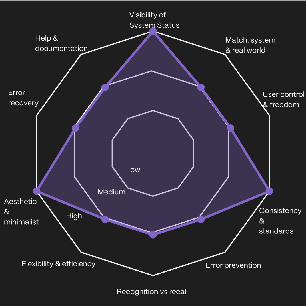
Before running usability tests, we conducted a heuristic evaluation of both the desktop and mobile prototypes using Nielsen’s 10 usability heuristics as our framework. Each team member reviewed the designs independently, then we consolidated our observations into a single report. This gave us a structured view of the design’s strengths and weaknesses.
Through this process, we uncovered several issues that might not be obvious in a static prototype. For example, some settings toggles didn’t behave consistently, instructions were longer than necessary, and critical actions lacked confirmation messages. While these weren’t tested with users yet, they signaled areas that could undermine confidence or efficiency.
Desktop :
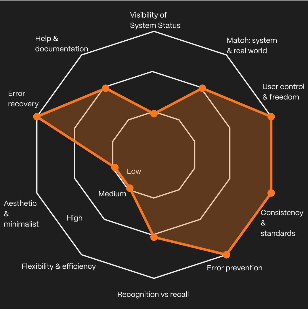
Mobile :
How It Shaped Our Usability Testing
The heuristic evaluation gave us an early indication of where users might struggle. Instead of treating these as abstract findings, we translated them into realistic scenarios to see how they played out with actual participants.
We designed scenarios that closely mirrored real-world actions members would take in the portal. Each scenario reflected a common task in managing healthcare communication preferences. Participants were guided through situations such as:
“Imagine you are setting up your online profile for the first time and need to add your mobile number so you can receive text updates about your account.”
“Now imagine you’d like to go paperless and receive all communication digitally instead of by mail. Please update your preferences accordingly.”
“Finally, imagine you’ve changed your mind and would prefer to receive physical letters again. Update your settings so that certain communications are sent by mail.”
These scenarios ensured participants engaged with the portal in ways authentic to their everyday needs, while letting us validate risks from the heuristic review and assess task success, efficiency, and user confidence.
Usability Testing
Building on the scenarios shaped by our heuristic evaluation, we conducted moderated usability testings. Sessions were held remotely, where participants shared their screens and thought aloud while attempting tasks on both desktop and mobile prototypes of the portal.
Throughout testing, we captured both quantitative metrics, task success rates, time on task, number of errors, and qualitative insights from participants’ comments and behaviors.
This approach allowed us to go beyond whether participants could complete tasks, and instead measure how efficiently and confidently they did so, while revealing where friction points slowed them down or led to errors.
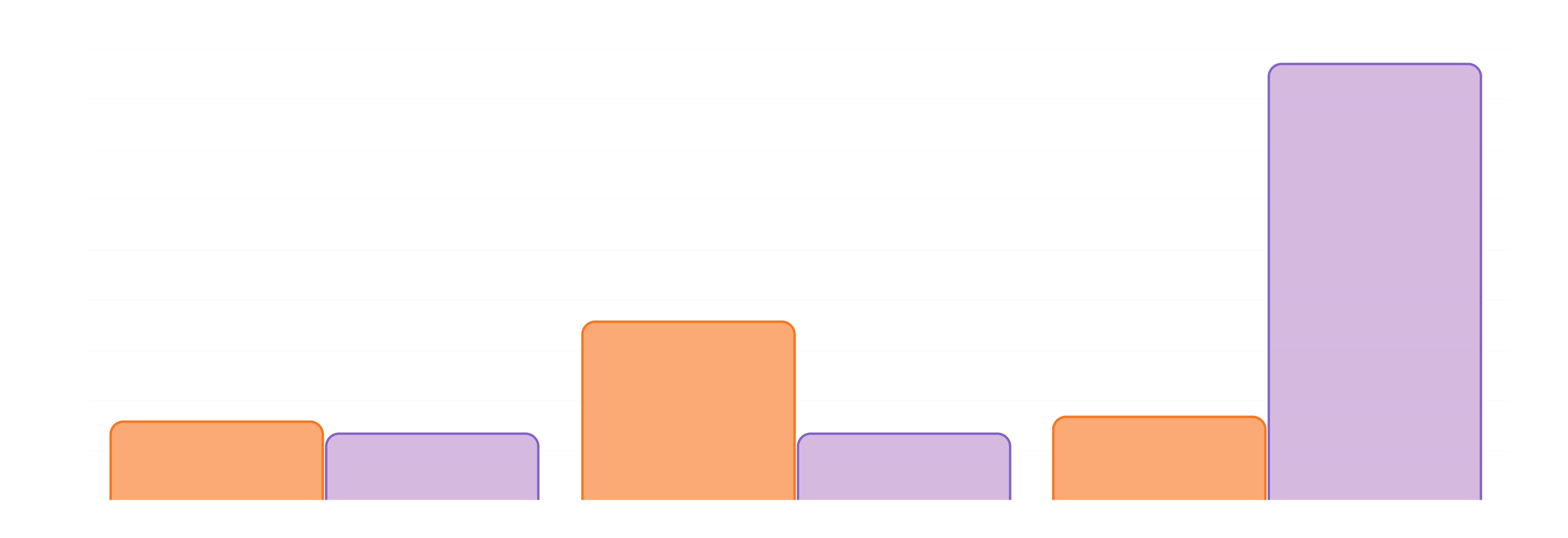
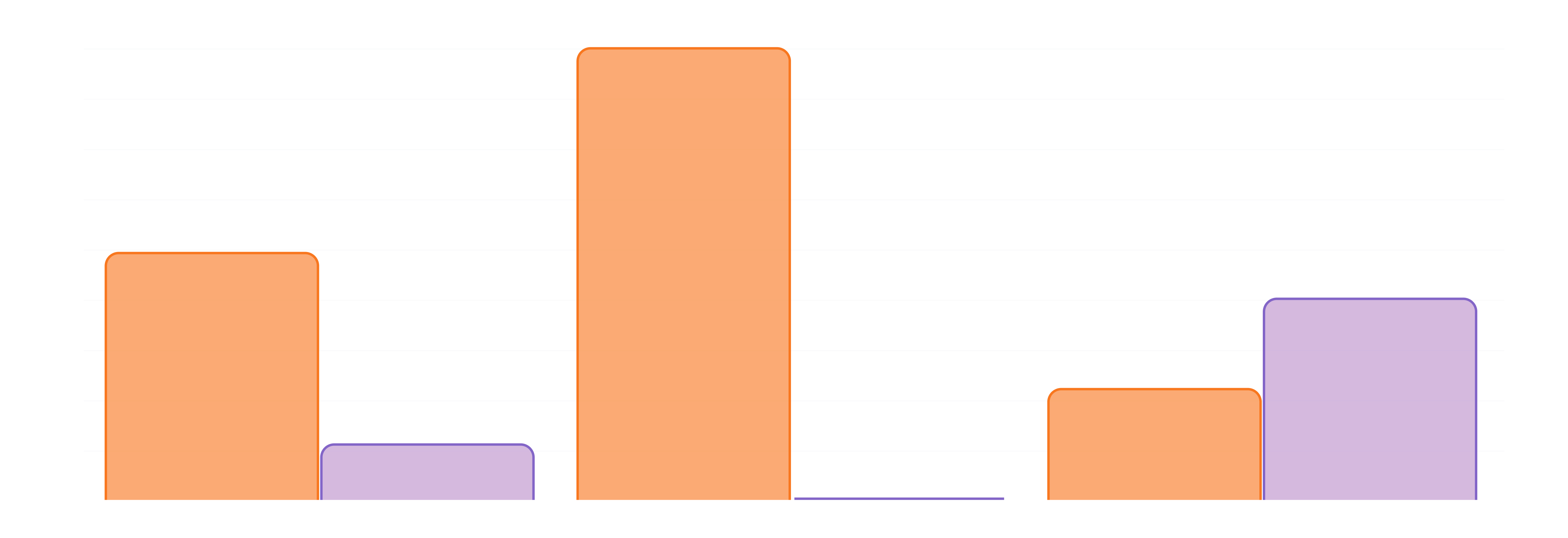
Results
The usability testing highlighted clear differences between how participants performed on desktop versus mobile. While some tasks were faster and more accurate on mobile, others exposed major friction points.
Success Rate
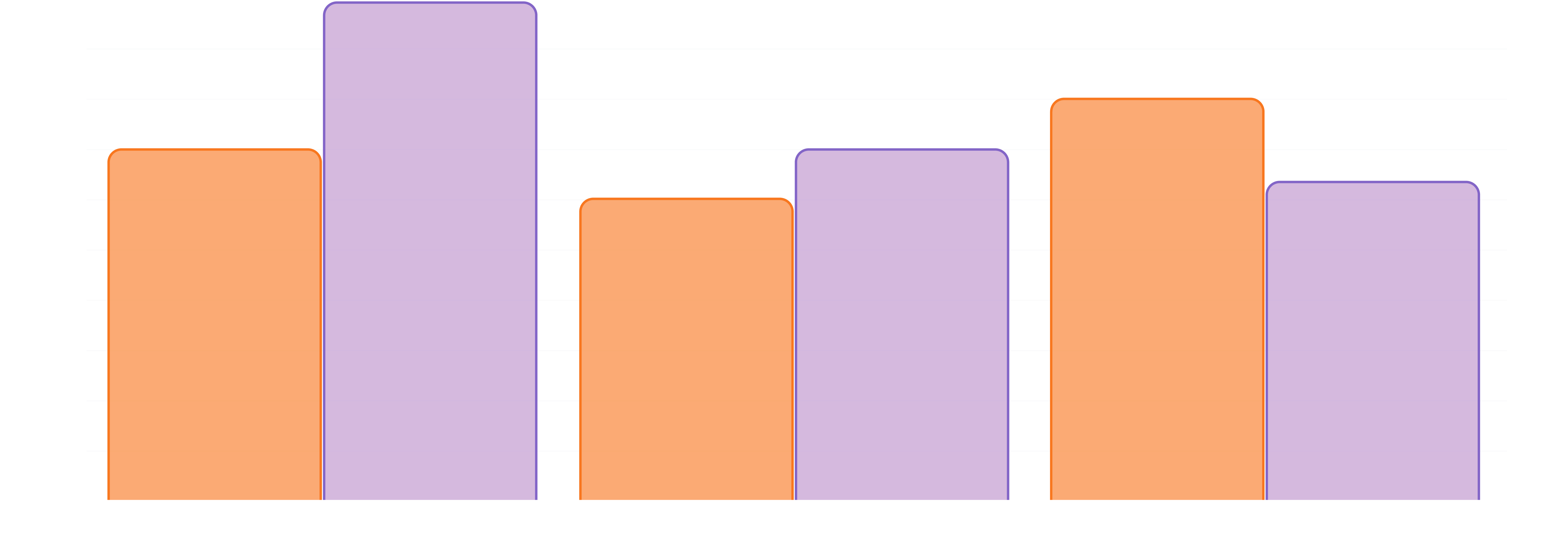
Average Completion Time
Average Errors
Qualitative Observations
Participants often hesitated due to missing feedback, struggled with confusing terms like “mail” vs. “email”, and grew frustrated when toggles didn’t behave as expected. Long instructions were skipped, while mobile users in particular expected quicker flows.
Older participants tended to double-check actions and seek reassurance, while younger ones skimmed text and pushed ahead, even when unsure. These patterns explained the errors, delays, and confidence gaps reflected in the metrics.
“On my phone I’d expect this to be quicker, why is it taking so many screens?”
— Usability testing participants“I clicked it, but did it actually save? I don’t see a confirmation.”
— Usability testing participants“On my phone I’d expect this to be quicker, why is it taking so many screens?”
— Usability testing participants“If I choose paperless for everything, why do I still have to check all these boxes?”
— Usability testing participants“Wait, does mail mean regular mail or email? I thought they were the same thing.”
— Usability testing participantsRecommended Suggestions
Based on the issues uncovered in testing, our team proposed five usability fixes to improve the portal’s communication preference center:
Add confirmation feedback
Provide clear success messages (e.g., “Your number has been added”) to reassure users and reduce hesitation.
Clarify terminology
Differentiate “mail” and “email” with distinct labels or icons to prevent confusion across age groups.
Simplify toggle behavior
Ensure global options like “Go paperless for everything” apply universally without requiring additional steps.
Shorten instructions
Replace long paragraphs with brief, scannable text to support both skimmers and detail-oriented users.
Introduce a Save button
Give users explicit control to finalize changes, boosting confidence and trust.
Outcomes
- 40%
increase in task success rates by simplifying flows and adding confirmation feedback.
- 50%
reduction in task completion time, cutting average actions from 88s to 32s.
- 64%
decrease in user errors by clarifying terminology and fixing toggle behavior.
Learnings
Accessibility isn’t optional in healthcare
Participants highlighted that unclear labels, low-contrast text, and non-descriptive buttons created anxiety during high-stakes tasks. Designing for accessibility is not just inclusive, it’s essential for patient trust and safety.
Good UX Writing is essential
Even small mismatches in wording (“Claims” vs. “Bills”) created confusion. I learned to validate terminology through user language mapping before finalizing content.
Stakeholder alignment takes empathy too.
Balancing the needs of patients, providers, and internal teams required early communication and shared success metrics. I learned that human-centered design applies to both users and collaborators.